Trying out some isometric art and also experimenting with ACES workflow. Also an project for me to get familiar with Blender-Maya workflow.
Why Blender-Maya, not just blender?
Blender is amazing for what it is and what it can do. For this project, I am only use it for modelling. The hotkeys really reminds me of back in the day when I was using Cinema 4D. I love it, it's so fast. Maybe later on I would use Blender for other stuff, but so far I will stick with only modelling with it.
Why still using Maya? Maya being the industry standard, it works will with my home pipeline and the color management is so much better, as well as the arnold renderer.
Below I will breakdown some of the process to get the final image.
ASSETS
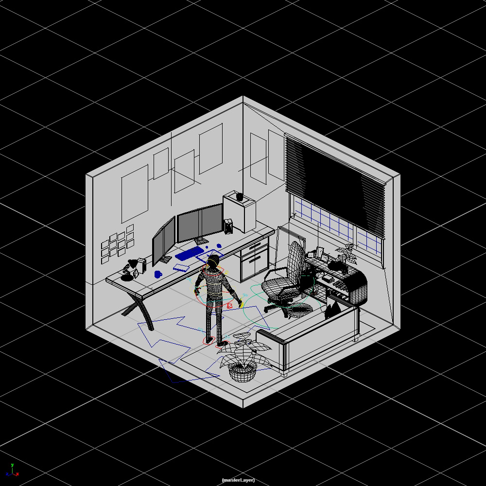
Models in blender
Assets assembled (coloured with objectID)
in order to make the room feels like a real room where someone would actually lived in, it needs to feel "busy". Which means there are a lot of assets that needs to be build. I got some of the models online so it doesn't drive me crazy to model very single piece.
LOOKDEV
there are a lot of isometric art online, most of the them are stylized. For both model and shading. Many are low-poly, but I wanted to go for a medium point between realism and stylized. So I went for semi-stylized model (the character) and realistic shading (almost everything else).
LIGHTING
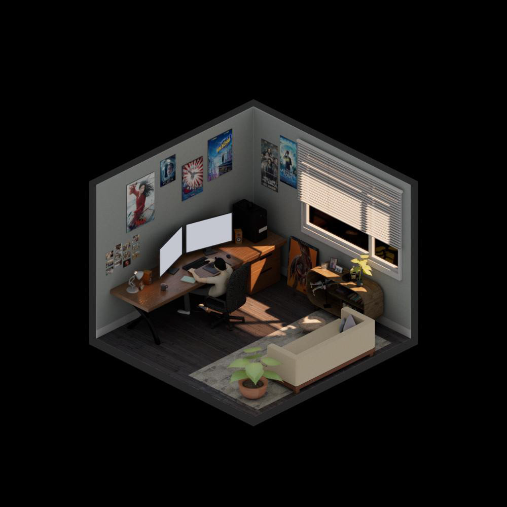
Morning

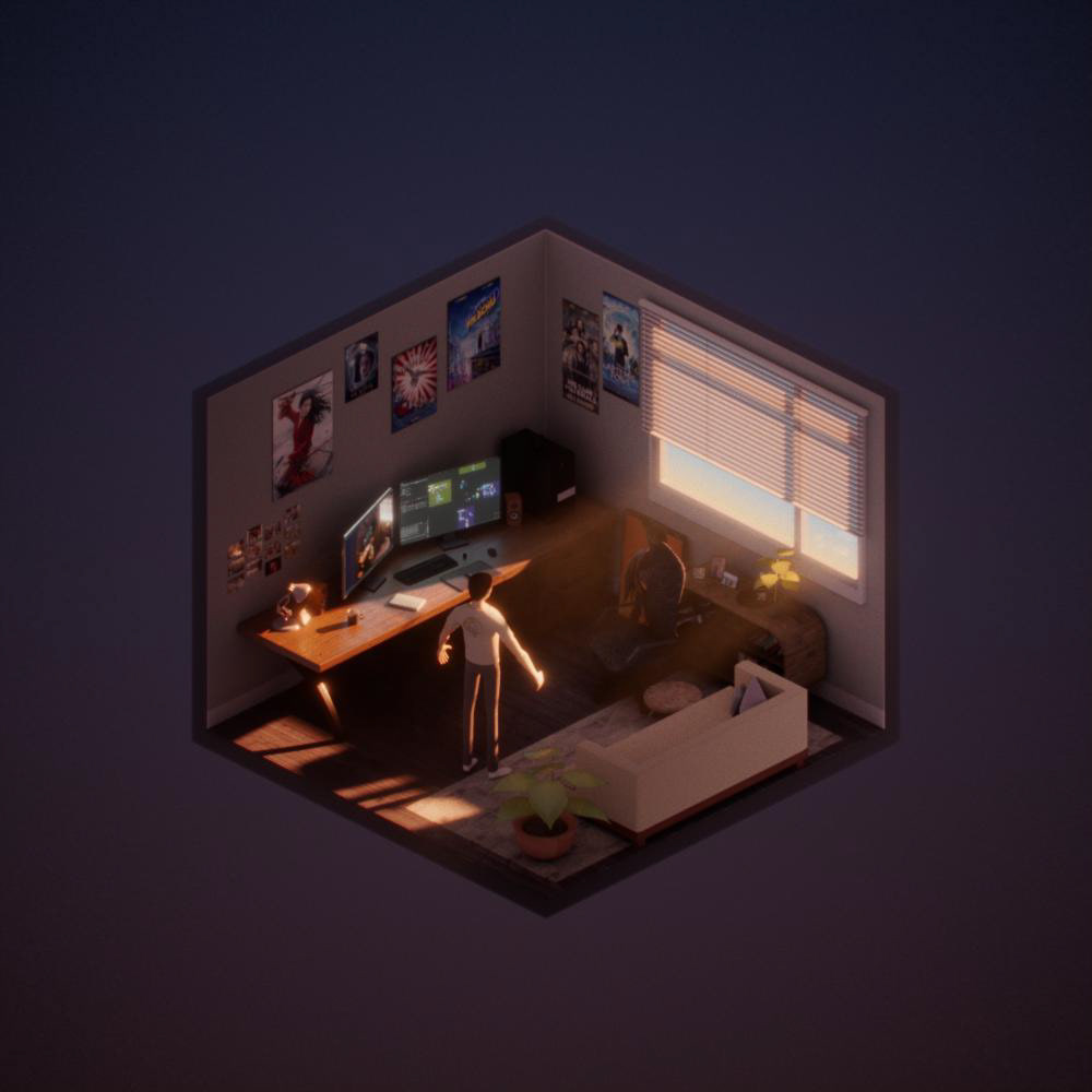
Afternoon
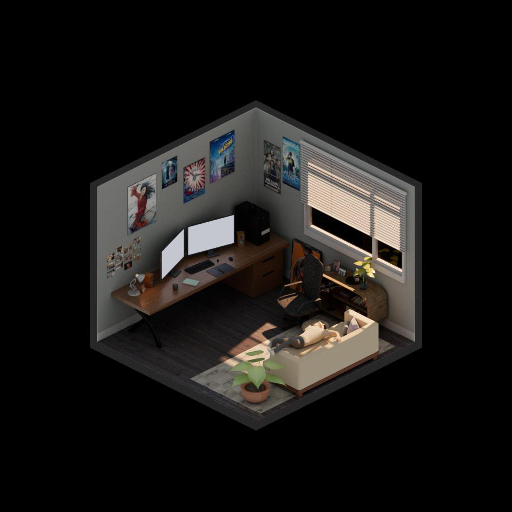
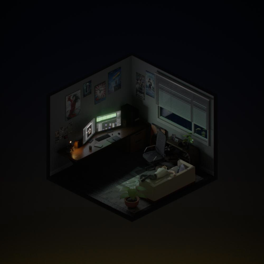
Night
I lit the scene for 3 scenarios: Morning (left), Afternoon (middle) and Night (right)
In lighting, I use the angle of key light/window light to show the time of the day. I know with only angle of light it doesn't create the mood and also hard to tell the time. That's where the comp comes in. I could do it in lighting, but I feel comp will be easier to get the colour right. So I rendered everything with no color temperature.
COMPOSITING
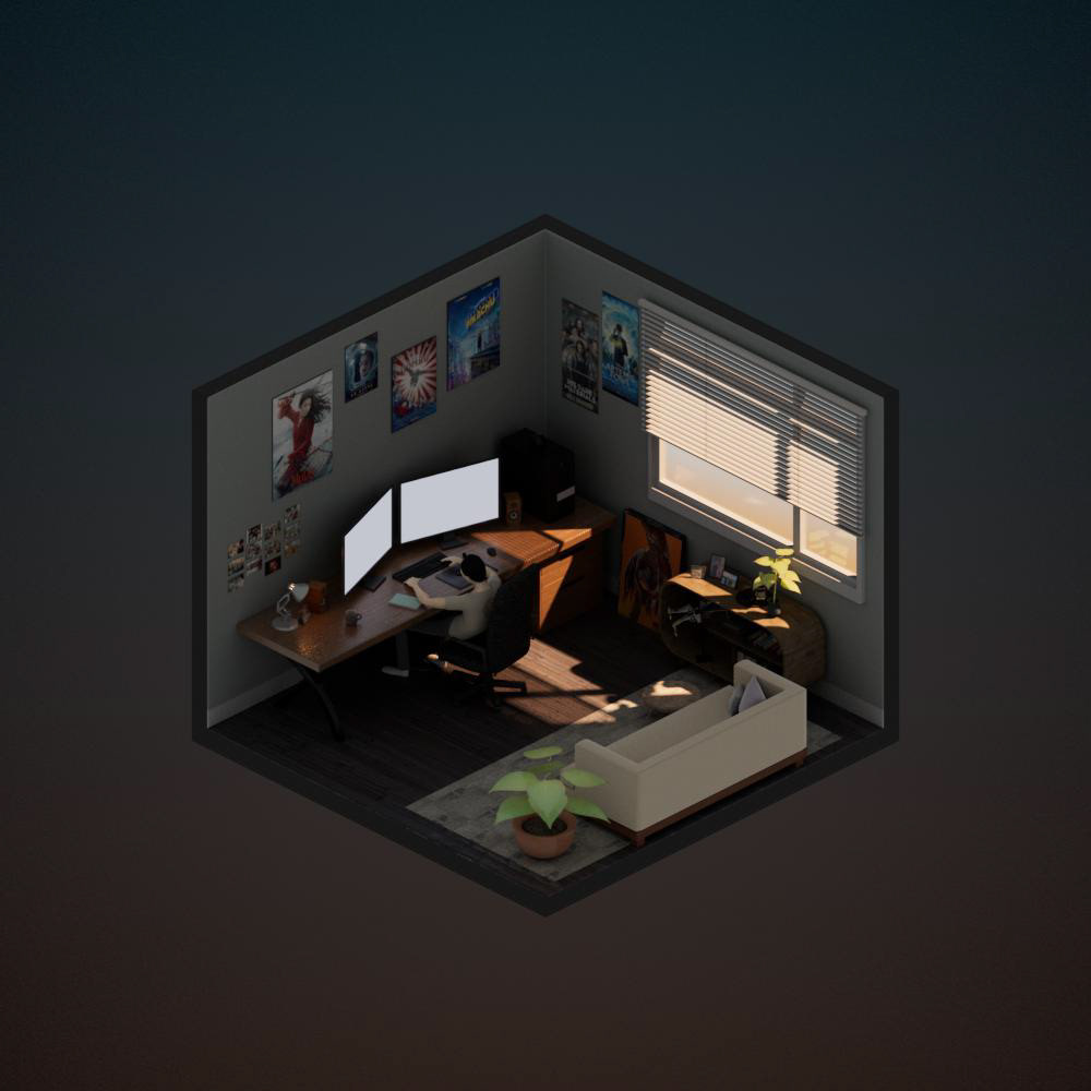
lgtslap: Morning
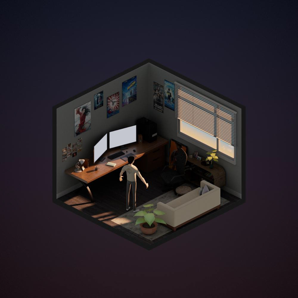
lgtslap: Afternoon
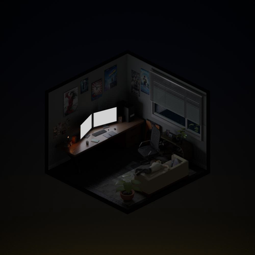
lgtslap: Night
With some quick slap comps, I use multi-light passes to better resemble what I am thinking, Just for the overall value of the scenes.
As you might have also noticed, the change of colour of the background. I was planning to do just with solid colours, but as I tried different things, colour gradients works a lot better.
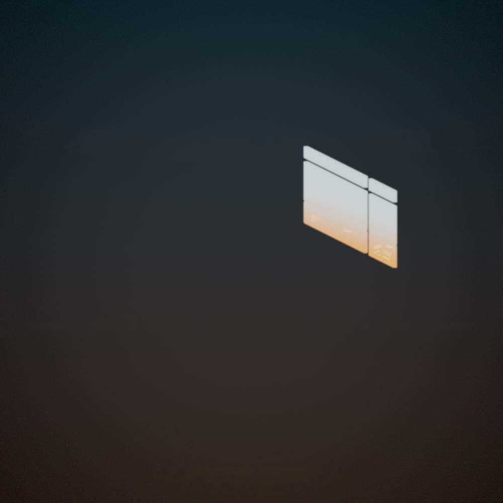
bg: Morning
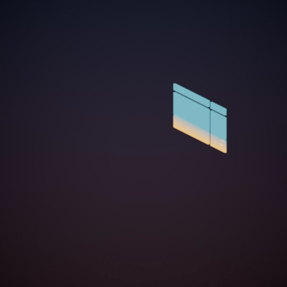
bg: Afternoon
bg: Night
The gradient for each time of the day, I sampled, or an impression rather, of the sky colour from morning to dawn.
- Morning: Sunrise colour fades to deep blue sky at the top
- Afternoon: Magical warm tone fades to the deep blue sky (I shift it towards more of a purple hue, to differentiate the Morning color)
- Night: The yellowish street light blends with the dark sky.
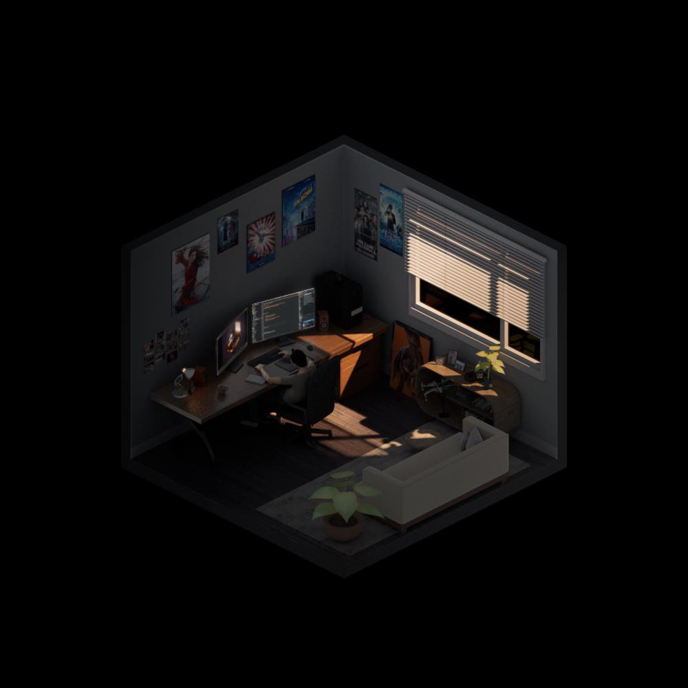
firstpass: Morning

firstpass: Afternoon
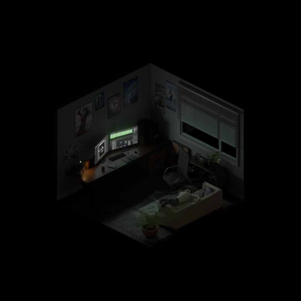
firstpass: Night
First pass of comp to better create the mood.
This time I spend bit of time to get the window light and ambient light colour right. By adding cjamge pf colour temperature to the mix. The image feels more cinematic and better contrast from one to another.
My key shot is the Afternoon scene. One because afternoon sunset is always the best time of the day and it looks the best. To create more of the atmosphere, I created 2d god rays to better enhanced the mood.
Really love the hightlight glow on the right arm :p
Below are some of the before and afters

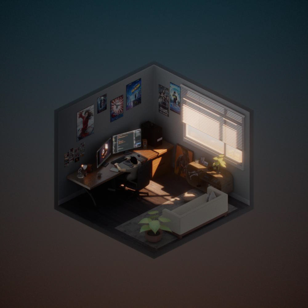
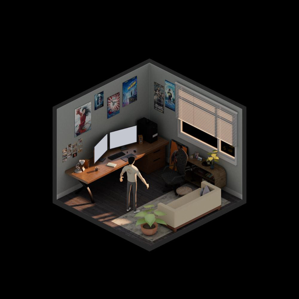

This is an overall fun project to do. The ACES colour space really makes the colour pop and blends so much better. And surprisingly, it is very easy to setup, for a full cg shot at least. I would guess it would be a bit completed to set up with a live action plate.
More images from the project:
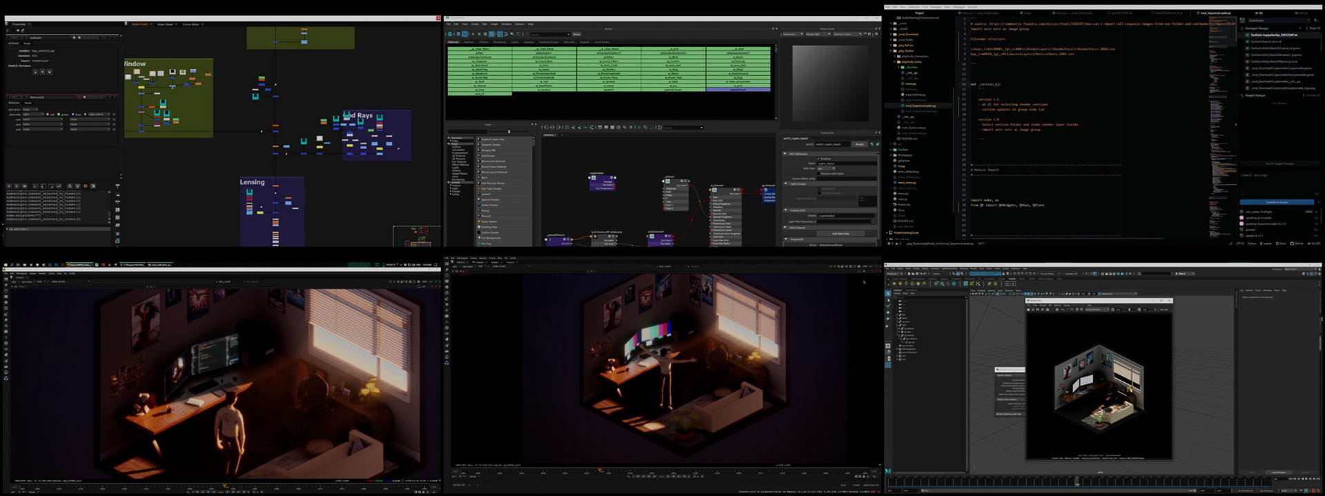
and a screenshot of my node graph :p